User Onboarding
This project looks at bringing new users onto the Rotaready app and documents the process, challenges and solutions we experienced.
📕 Read time - About 7 minutes
🔎 Project includes - Research, wireframing, user testing, UI, dev review, demoing, documentation, handover and project planning.

Hi fidelity screens
My role and the team
💻 The core team consisted of - 1 Product designer (myself), 1 Senior engineer and 1 Head of engineering.
Background to the project
At Rotaready we had hundreds of users join the mobile app per month. However, managers and HR departments are manually having to populate employees’ personal and document details via the staff page on the desktop app. This was causing them regular pain points and became a time-consuming task.
It become apparent we needed to smooth this process out. Through stakeholder discussions, we eventually landed on the idea of onboarding new users to the app, requesting details when they first use Rotaready.
This decision should save managers time and a tedious task as well as making hiring and staff turnover an easier experience. For the employee, it makes the process more efficient so they get paid quicker, share sensitive information safer and are welcomed with a better experience.

Some companies from comp analysis
Kick off meetings and stakeholders
The starting point for the onboarding project was hosting a kick-off meeting. Members from the success team and dev joined as stakeholders. Both sides brought valuable insight into the problem as we began building out a rough architecture of pieces that already existed, along with documentation. They also helped answer any questions I had.
We discussed current and potential pain points and target audience, through to what project success would look like and listed out anchor points to refer back to.
As a company we knew what information we needed, industry-compliant data, from the employees to onboard with. Particular areas needed more consideration and discussion, such as passports and documentation because of security and storage. We also agreed on what could hold off until v2 and onwards and what was absolute MVP.
Project goals
We aim to have users upload their details to Rotaready quickly and efficiently, all while being impressed with their first interaction with Rotaready and feeling encouraged about using the app for their job. We want to try and keep a high success rate of onboards without users feeling lost and calling support. Managers should report back to us saying how much time they’re saving while accuracy is the same or better.
The project anchors were:
Efficient data gathering and as quick to use the app as possible
Gain user’s trust, make them feel encouraged and safely uploading data.
To feel fresh, slick with no pain points.
To look clean and simple and consistent with the app
Information architecture
Because the onboarding IA had been discussed at the kick-off meeting, it was already in a healthy place. Generally, all the pieces were easy to navigate into the right place, however, around documentation and passport upload there were some trickier branches with multiple steps which needed to be mapped out.
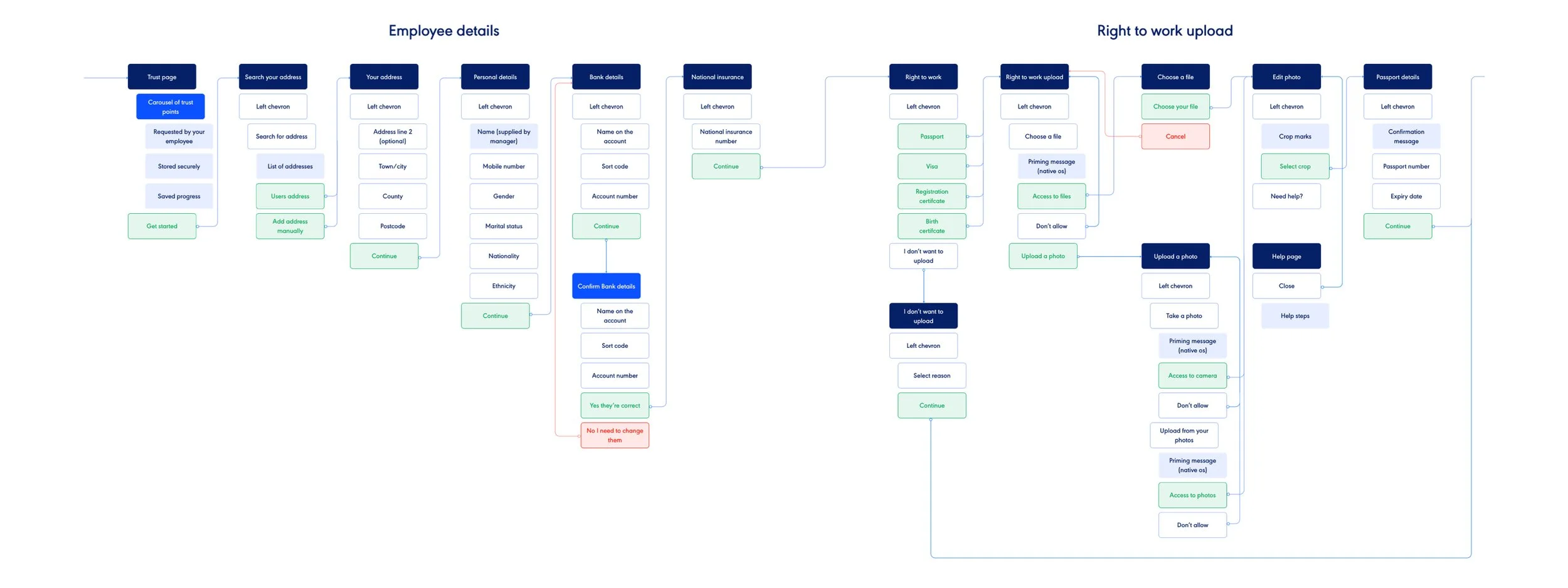
A section of the IA
Competitor analysis
After speaking with the stakeholders and learning about the problem, armed with a rough IA, I began to start some research into the problem.
Onboarding was a problem that had been solved many times over, yet the devil was in the detail. I onboarded myself across a range of apps from varying sectors. I made notes and took screenshots when things were done well. I always referred back to the problem we were solving and found that a lot of the apps would have had similar anchor points. Things like efficiency and security were always apparent.
I was finding this would be a great opportunity to show off the Rotaready brand and focus on the smaller details of UX. I spent time researching into some best practice mobile app UX, things as notification priming and guiding users as much as possible to avoid dropouts.
“The audience is the end-user. This is also likely the first time they have used the Rotaready app. This user ranges from tech literate to incredibly non-tech-literate so really we are designing to the latter.”

Example of user persona and journey
Personas and journey mapping
To help assist and anchor the onboarding project back to our users, we created a range of personas. Our audience ranges from 16 - 70 years old, meaning we were designing for a wide user base.
We created non-empirical personas. We started with second hand research into the different generations and their behaviours, combined with input from our success team who regularly spoke to the end users, we came to a group of outcomes.
We also mapped out some joy and pain points that each of the personas would experience, helping empathise with our users.
Wireframes
With a better understanding of the problem and some research conducted, I moved on to the wireframes.
I decided that we could dive straight into mid-level wireframes, skipping any hand-drawn or Balsamiq-esqu stages. We had a fairly nailed down IA and flows, along with keeping the design as intuitive as possible, which meant I wasn’t going to be spending too much time conceptualising ideas. With efficiency and ease being anchor points, I was focusing on laying out the architecture as cleanly as possible, along with focusing on areas such as wording and good practice UX.
I would demo the wireframes to the stakeholders via Sketch on a big screen, keeping it pretty informal but still gaining their input and feedback at regular stages.

Sketch wireframes document
Sketch wireframes
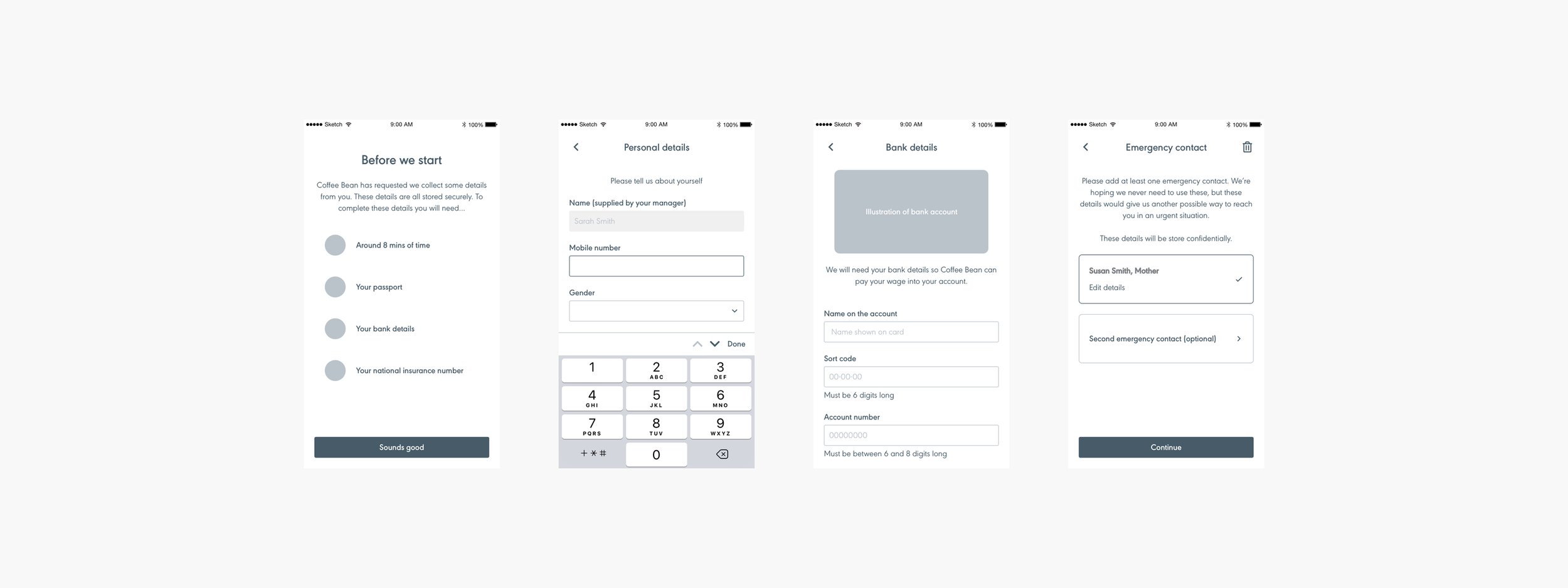
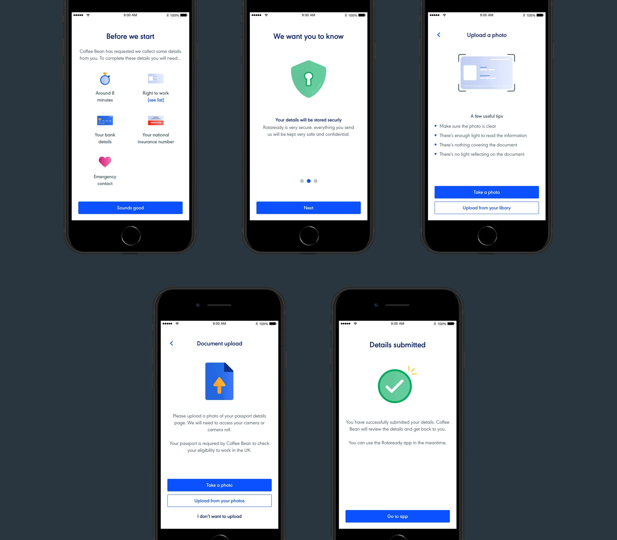
User interface
Once the wireframes had gone through several rounds of iterations and we felt that they were in a healthy place, I moved on to the UI. Like one of the anchor points, we wanted to keep the onboarding consistent with the mobile app. At Rotaready, we have a Styleguide pre-built, meaning that a range of components could slot into the onboarding project with ease and moreover, consistency.
This helps in making decisions and designing pages quickly. I could focus more time on pixel pushing and tweaking wording.

User interface screens
Best practise UX
As previously mentioned, a few examples of the details with the onboarding project were notification priming, briefing users about what’s needed and correct keyboards for tasks.
Telling users what’s needed
Before users would start entering information, we let them know some important details we needed as well as the amount of time it would take to complete.

Telling users what’s needed
Priming notifications
Having users click within the flow to allow our app to access their OS, instead of just popping up and requesting we access their phone’s camera for example.

Priming notifications
Correct keyboard for input
Seems pretty straight forward but to ensure we built a good relationship with first-time users we need to get the basics spot on. Having ABC keyboard for text and numeric for numbers is important.

Correct keyboard for input
Illustrations
One particular section that was unique to the project was the supporting illustrations. These were all made in Illustrator.
We have an illustration style at Rotaready which was designed at the brand refresh. Again, we wanted to keep the experience consistent with the brand. These illustrations gave me an opportunity to give that slick feel we wanted to onboard while still serving the purpose of supporting the flow.
They help keep the flow fresh and pleasing to the user.
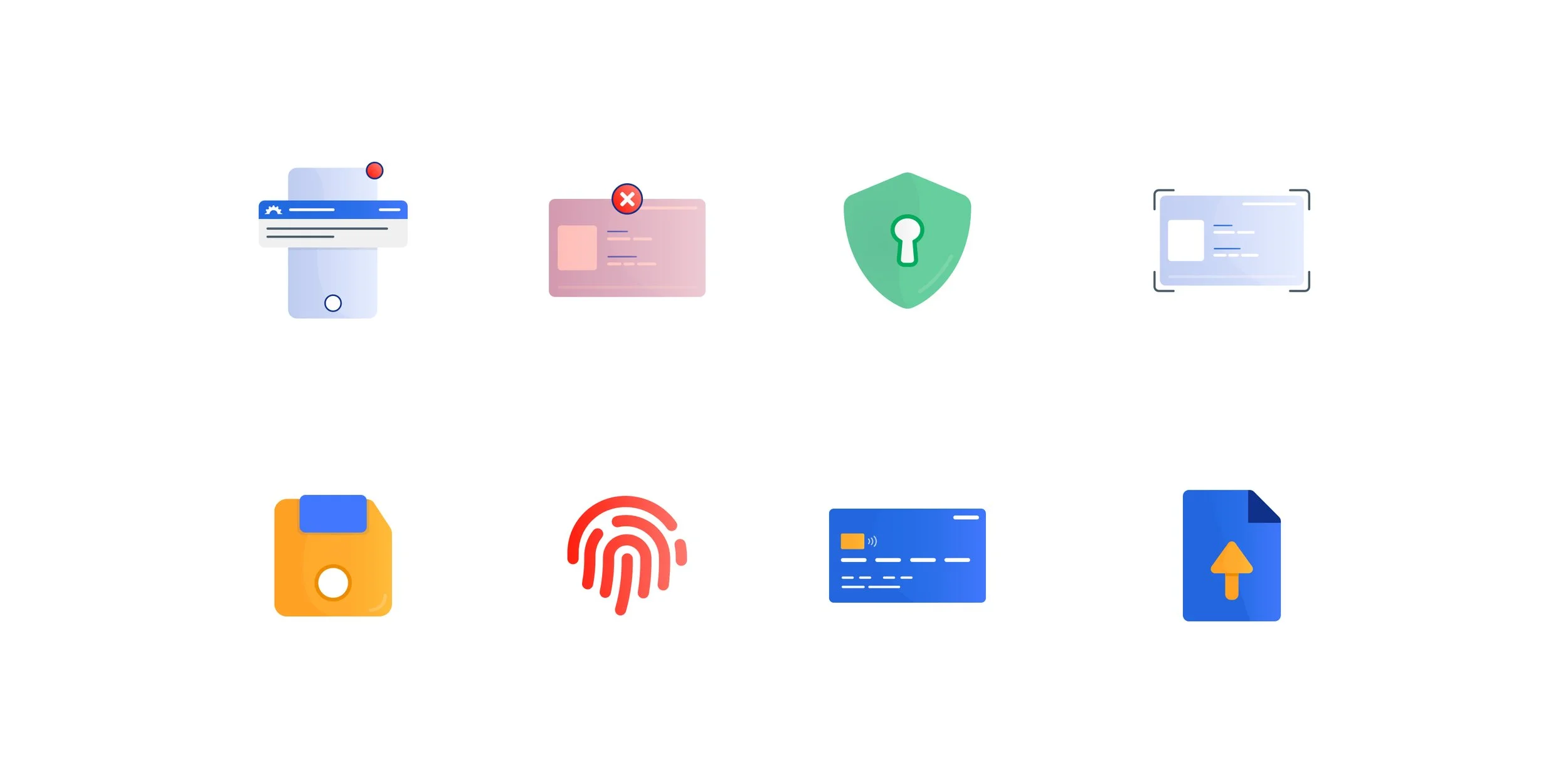
Illustrations for onboarding
Prototyping
By now there had been several demos and catch ups with the project stakeholders across both wireframe and UI stages. However, it was all show and tell format rather than trying it out in situ. It was time to bring the project to life and create a prototype we could click through.
I used Invision to stitch the pages together and add in realistic page transitions. I created every potential flow and branch so it behaved as accurately as possible. We could then use the prototype on our phones and experience it as it was designed for.
Side note, this prototype helped our sales team with a bunch of demos and sales!
Invision prototype
User testing
Now that we had a working prototype it was easy to start conducting some user testing. We used 2 methods, some in-person testing sat next to the candidate, and some remote testing, both using Useberry.
I created a script and details for an employee that had just started using Rotaready, which was shared with the candidate at the intro. I set tasks that needed to be completed and watched how the candidates got on.
Useberry records the sessions which are great to re-watch and evaluate. I made notes and recorded feedback from the tests. Generally, there wasn’t anything immediate that needed addressing which was good news, the research and detail-orientated design was paying off.
Useberry testing
Micro Interactions and animations
One area we wanted to spend a bit of time exploring was micro-interactions and animations. These were the nice flourishes that helped cement a good experience and brand. I spent time working in Principle and Protopie animating pages, taps and slides and paired with the developer ensuring these could be implemented into our code base.
For the animations, I used an SVG animator which could export to Flutter. I played around with different animations and transitions until we found that we liked.
Micro interactions
Results
The project was launched Launched Sept 12, 2022. It was traditionally for new users as we were going through pricing changes which the feature was part of.
All of the data was pulled from QuickSight, around 6 months after the launch of the project. There was around 85% success for onboarding users. This was from opening the app, right through to successfully submitting details.
For the haven’t completed number, this can be for multiple reasons, including they have left the company or they opted to do it manually.
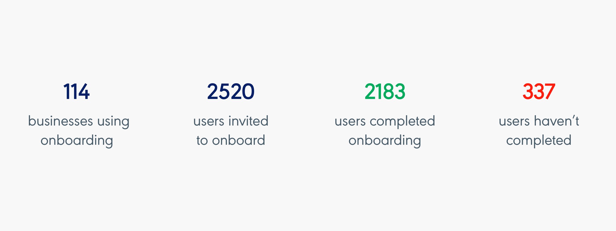
Results taken from QuickSight
Sign off
User onboarding is currently being rolled out to our customers. We’re trialling it as a premium service. This helps ease the release as we can collect feedback from a smaller user base. The only problem is that now we are charging extra for the service it’s expected to work perfectly, right out of the box.
We have communicated it is still in the beta stages so will need iterations. Companies seemed ok with this since the trade of is saving large amounts of time for their managers and HR departments. We will be collecting feedback via Intercom and from the success team.
For now, we are waiting for the project to be released and then we can start recording feedback and any bugs. We’ll work through these and iterate accordingly.
More to come soon.
“This is a very real solution to a very real problem.”
“This sounds like a great feature. We would love to give it a try.”
“This is a great new addition to Rotaready, nice work!”
Hi-fidelity screens