Design System
Using Atomic Design and systems thinking to create consistency across the Rotaready product and company.
📕 Read time - About 6 minutes
🔎 Project includes - Planning, auditing, research, systems thinking, design, UI, dev pairing, documentation, handover and updating.
ℹ️ Please note - This project has now been moved to Figma
Sketch and Storybook screens
My role and the team
💻 The core team consisted of - 1 Product designer (myself), 1 Junior product designer, 1 Head of engineering, 1 Lead engineer, 3 Engineers, all working on the project at varying stages.
Introduction to the project
‘A living, breathing document’ is what we refer to our design system as — forever being tinkered with and adapted, refined and refactored. However, at one point Rotaready had no source of truth and everything was a mish-mash of components, colours and sizes.
Rotaready had gone through a brand refresh. The logo, colours and typography had all been updated, which needed to be reflected in the product experience. Moreover, combined with the inconsistency of components across the old Rotaready app, we felt a single source of truth was needed. Thus, the Rotaready design system project began.
The objective was to harmonise reusable components and patterns to create consistency across the Rotaready product. We needed to ensure scalability and future-proof the product.
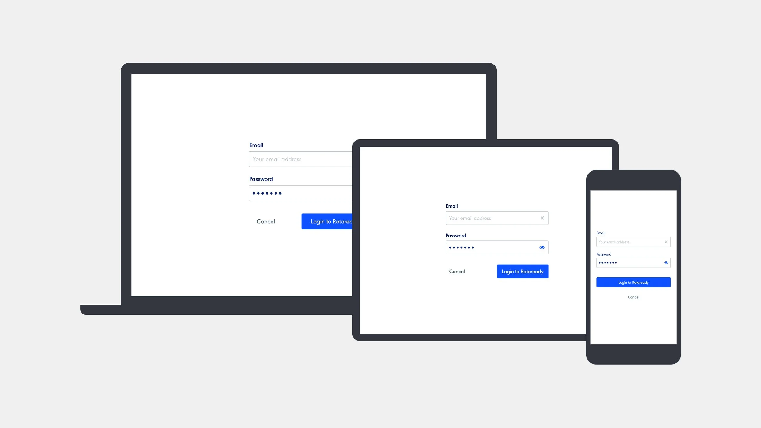
Repeatable components across all devices
Project planning
We were facing a handful of problems that we felt a design system would help to solve. The first was our team was growing and changing. We needed to continue producing work at a fast pace and of good quality but resource was running thin. Additionally, as previously mentioned, we were finding inconsistencies across the product and app. This made for a confusing and poor experience for users. Finally, the terminology was becoming diluted. With more members using their own interpretation of language, we were not only confusing ourselves but also our users.
We listed out key anchor points for the project and how a design system would help.
Anchor points for the project:
Faster decisions. Can spend more time-solving problems, knowing UI implementation can be quick.
Helps bridge between users and Rotaready products. Consistency across multiple products, increase quality experience and lowers user learning and frustration.
Helps bridge between design and dev. Helps engineers work quicker, ensure we all speak the same language, and align on how components work and look.
Also speeds up the engineering process, design isn’t blocking them from moving forward with dev as components already exist. Can oversee and pair work rather than having to design whole pages.
One source of truth for all things Rotaready. Create consistency, and reduces ambiguity.
Some of the design systems from competitor analysis
Competitor analysis and
current audit
Naturally, we began looking at successful design systems as a starting point. We explored a range of systems that we felt worked particularly well. IBM’s Carbon, Skyscanner’s Backpack and Shopify’s Polaris to name a few. These systems contained great documentation and a wide range of components that offered great insight into the thinking and workings behind these systems.
Alongside the comp analysis, we were also conducting an audit of our own components. We listed all the components out on confluence and grouped them based on our own thinking, referring to the research we were conducting if we weren’t sure. This was shared and iterated amongst the dev team. This was important as we could focus on good naming at this stage and how these names would translate into code.
Style pages
Starting at a sub-atomic level, we defined the basics such as typography, spacing, colours and icons. This level is a thin layer which touches all components. Parts of the style pages are defined by the brand, for example, some of the colours and the typeface used. However, the styles evolved with the product in mind, with the introduction of accent colours for example. We had to get these right as they would touch upon each of the platforms moving forward.
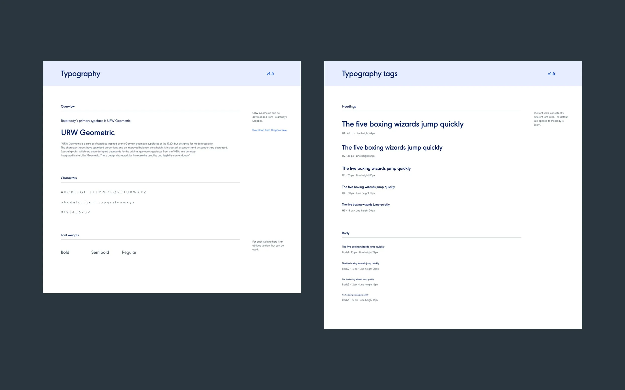
Rotaready typography
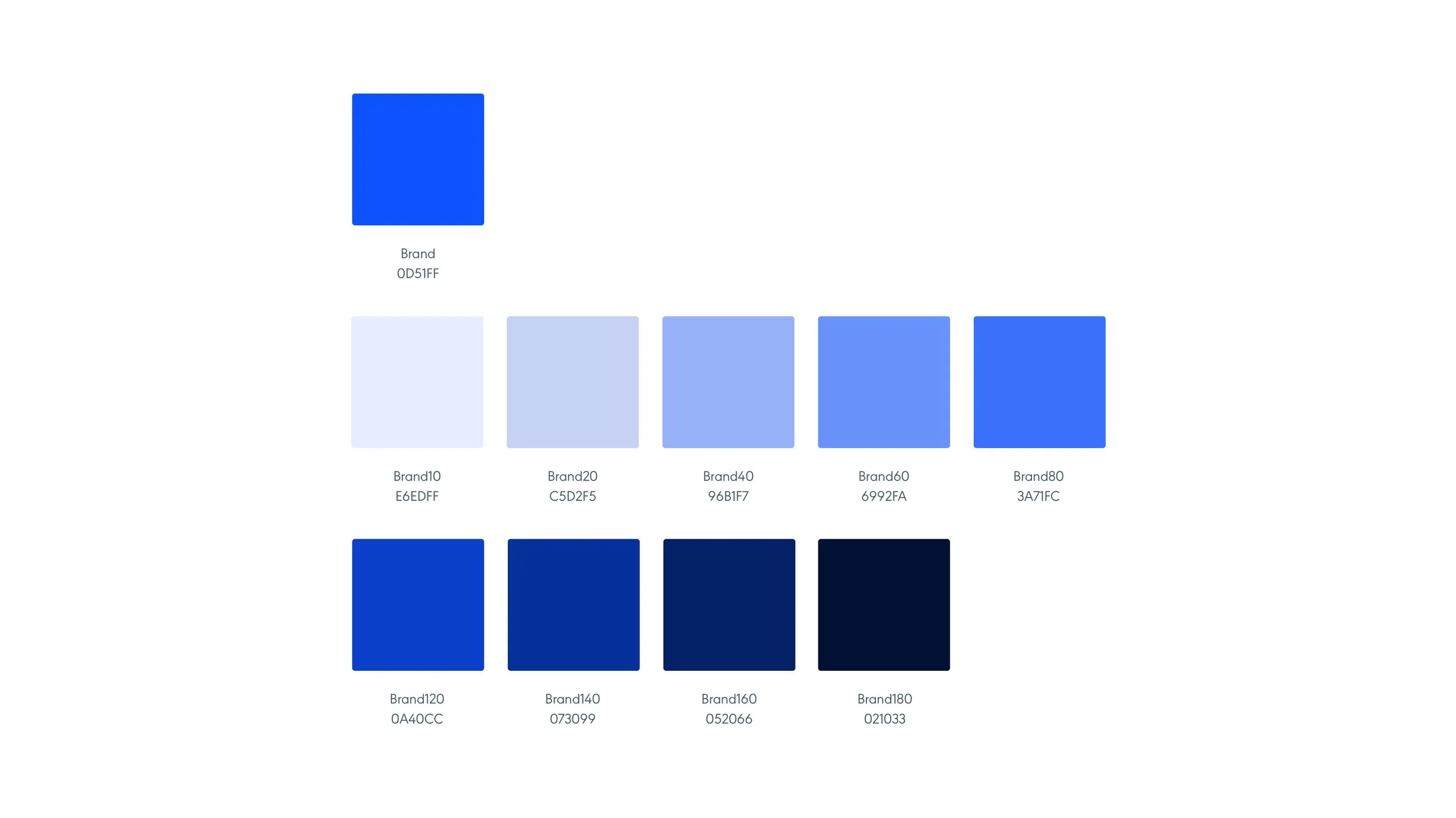
Rotaready’s colours
Rotaready strives to always be as inclusive and accessible to all users. We spent a lot of time considering WCAG standards and ensuring our colours were compliant. Even making sure the yellow works, which is always a little tricky!

Accessibility check
Brad Frost atomic design
One particular way of working within design systems is Brad Frost’s Atomic Design, something I’m sure many of you are familiar with! For those who aren’t, this methodology understands that products are made up of much smaller parts and groups them to build up components and eventually into whole pages.
Think of a text input. Then add a few text inputs together and you have a molecule, add some titles and form functions, then you have an organism and so on, right through to whole pages. A good concept sometimes referred to is lego building blocks. This methodology was used within our design system.

Brad Frost’s Atomic Design

Example of atoms through to molecules
Component pages
Now we had our foundation for the styles, it was time to move on to the components. We built out a whole bunch of components as a starting point, ones we knew we needed from the audit, and because they’re fundamental to a product working!
The components grew organically. In some cases, we didn’t have a specific component so we built it at a project level, and then retrospectively added it to the design system. This gave us flexibility when determining rules and style as we were using these components in situ rather than in an abstract case. Not all pieces made it back to the system however, some stayed at project level. Pieces we knew wouldn’t be reused anywhere else.
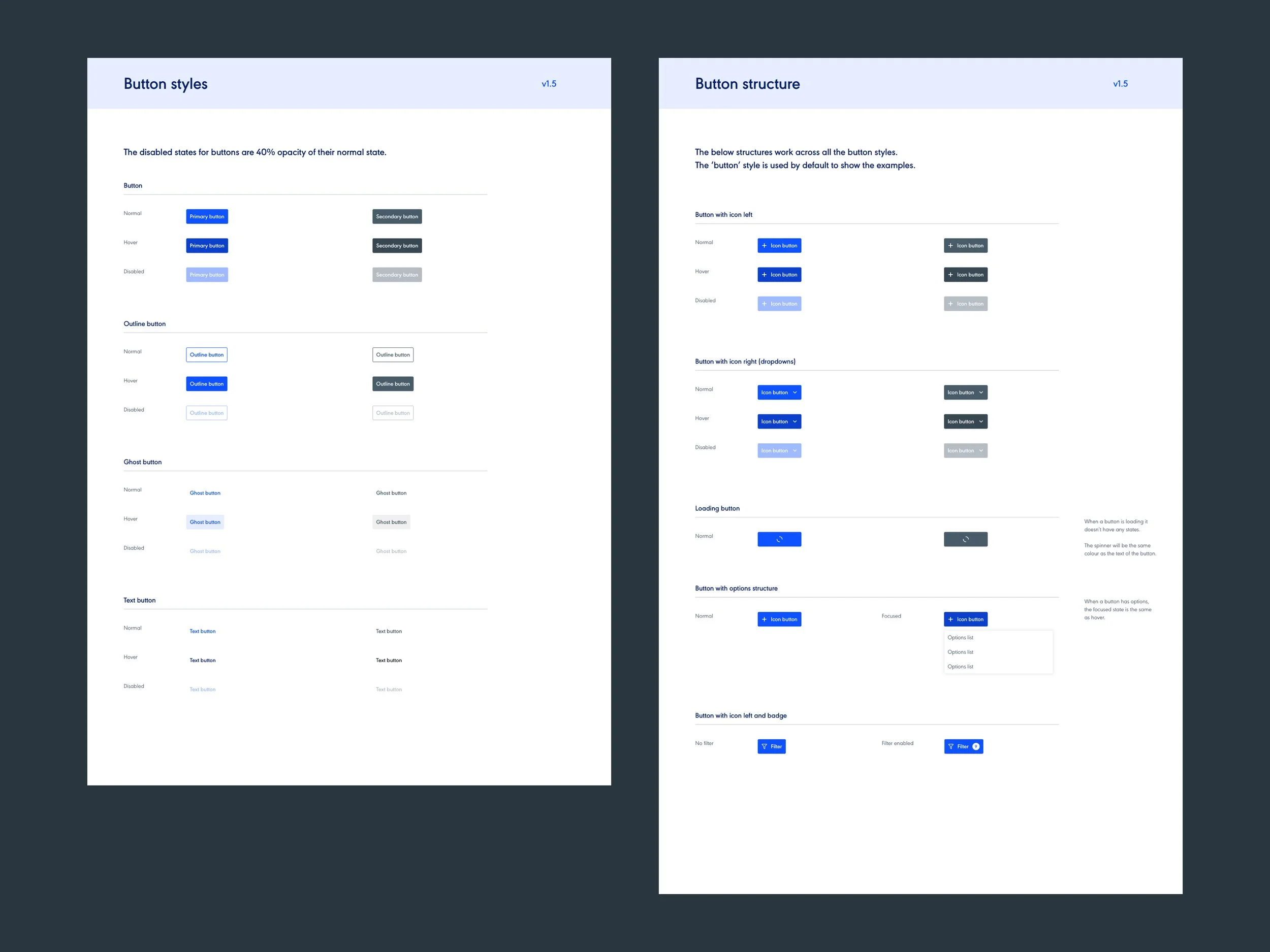
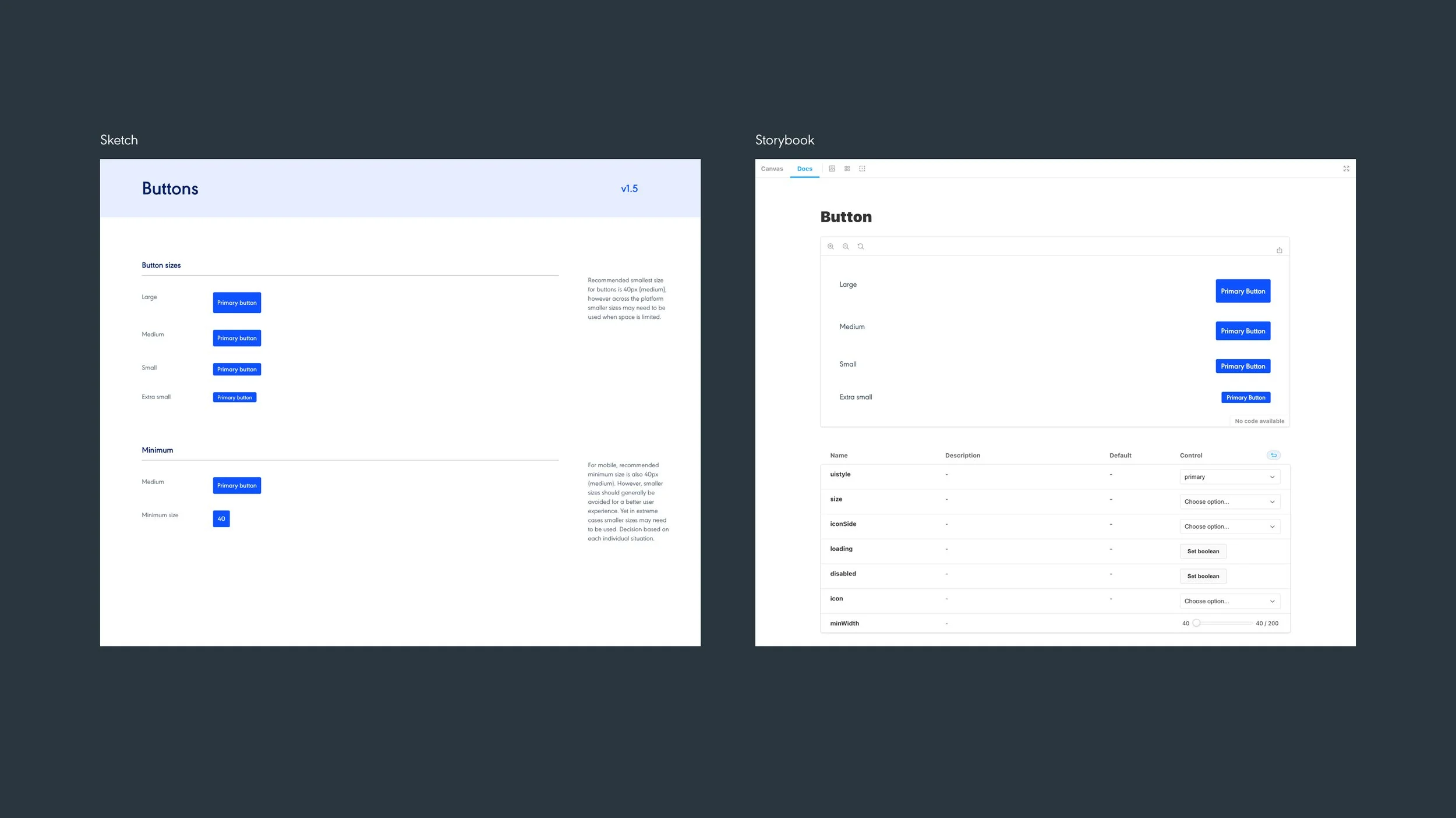
Variations of buttons
A shared language
One thing we noticed was our shared language was beginning to align across all channels, from design and development to customer success and ultimately the users. We found that communicating about the product was becoming easier and more streamlined, which got great buy-in from everyone about the importance of a shared language.
The additional benefit to sharing language was that this helped group components and structuring within Sketch and Storybook. It was important we didn’t stray too far away from any obvious naming patterns, referring back to our initial research if we were ever unsure or needed to decide and move on.

Naming components
Dev handover
So now we had our styles and components designed within Sketch, our next step was to start uploading everything Zeplin. Pages were grouped and uploaded together, ensuring that they followed the same layout as they did in Sketch. Zeplin allowed our developers to break down components and recreate them in Storybook. It also allowed the wider company a resource to go to for everything related to Rotaready design, such as typography and colour through to specific components and their documentation. This was our first step to gaining one source of truth.

Pages from Zeplin
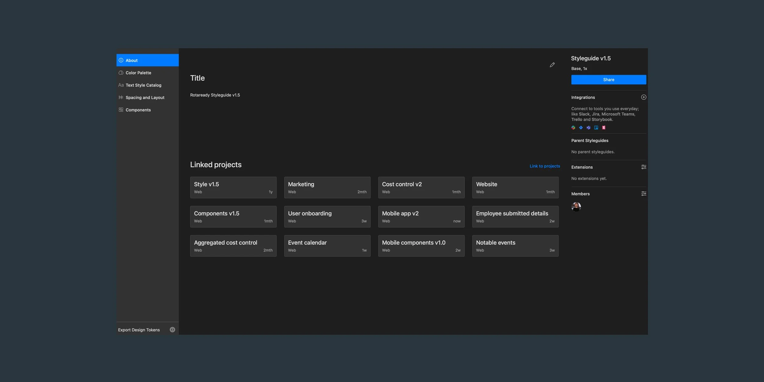
Projects that link back to our system
Storybook
At this point, everything we had was static. It was time to start bringing these components to life using Storybook. The developers transferred all the components from Zeplin into working, interactive pieces in Storybook. We could now see how they behaved when built and tinker them as we saw fit. Naturally, this took a little bit of time, pairing and collaborating to ensure they matched the designs, not just in the look, but movement, states and naming.
The added benefit of everything being in Storybook was, like in Sketch, these components would link across all projects, meaning they were the source of truth for the code. If we made changes, they could be done within Storybook and then rolled out, making changes incredibly easy and efficient. Our initial design system was beginning to take shape and components continued rolling into projects.

Screens from Storybook
Storybook recording
Versions
As I mentioned at the start, we referred to this project as a living breathing document. Our objective of creating a foundation for a bunch of components was complete. Since releasing the design system, we have gone through 5 rounds of changes and amends to date. When we were working on full pages, we found designs and code would be tinkered at project level. However, rather than rolling these right into the system there and then, we made notes of what needed iterating and then set aside time to go through and amend. Notes were kept on confluence, with links and screenshots to examples of what needed iterating.
Additionally, we found not all components were being used and some new ones needed to be added in. We introduced beta parts of the system and deprecated parts that were no longer needed, stating what would be used in its place. Technology is ever-growing and changing, our design system, and ultimately our product needs to be able to do the same.

Beta and removed pages
What next?
It’s ok to not have a final design system. It’s a product that is always in movement, we will always have to improve it, update it and maintain it. We have built a strong foundation that will help to future-proof our system and product.
Referring back to our initial project anchor points, all of them have been met. Our system is proving its worth in practice to this day and will do into the future. It aligned teams’ language, sped up our decision making and helps ensure consistency across our product. As a team, we have released multiple successful projects, all with varying involvement from design.
V1.6 will be coming soon!

Examples of pages