Mobile App
This project looks at the redesign and realignment of Rotaready’s mobile app and showcases each step within the process.
📕 Read time - About 8 minutes
🔎 Project includes - User research, wireframing, UI, feeding back on design work, documentation, handover and project planning.

Hi fidelity screen
Splash screen aniamtion
My role and the team
💻 The core team consisted of - 1 Product designer (myself), 1 Junior product designer, 1 Head of engineering, 1 Lead engineer, 1 Engineer.
Background to the project
Rotaready’s mobile app is the closest connection to our users and allows them to perform a range of tasks relating to their job. Staple tasks such as clocking into their shift or checking their rota, to more unique tasks like swapping shifts and requesting holidays. However, it was missing some needed features that users were shouting for that were integral to them having a good experience.
Additionally, with the new Rotaready brand starting to role out across the product, the app was feeling outdated.
Finally, there was an engineering need for the project to happen. The codebase for the project was dated and becoming hard to update. This meant that iterations were becoming problematic and bottlenecking releases and fixes, ultimately causing user frustration.
These three things combined meant it was time to review and update.
Our customer service team has a strong relationship with our users. They regularly ask about things needed within the product our users may need, as well as pain points caused. This was a great starting point for reviewing the mobile app.
Some companies from comp analysis
Research
We filtered through a whole range of requests and issues that our success team had collected. This started to give us insight into how our users were using the mobile app as well as things needed to make their experience better.
Unfortunately, due to time constraints as well as COVID-19, face to face interviews for user research wasn’t an option. Rotaready is a hospitality-focused app, the industry had currently fallen on hard times. We decided to focus on competitor research and would test early.
The main aspect of the mobile app is showing time. Ranging from scheduling, a user’s rota, to booking time off, they all utilise time. We decided to make the most out of our competitor analysis, we should look at products that also utilise time and draw inspiration from these design patterns.

A section of the IA
Wireframes, flows and IA
The next stage was to begin plotting out the content of the pages through an Information Architecture. Because the app already existed we referred to the current architecture, while considering if the current structure was best for the users needs. Things liking naming conventions, right through to nav hierarchy was explored.
Coinciding with the the IA, we began to plot user journeys. With the aid of the Success team, we had a few areas we knew needed work, as well as plotting the new feature journeys.

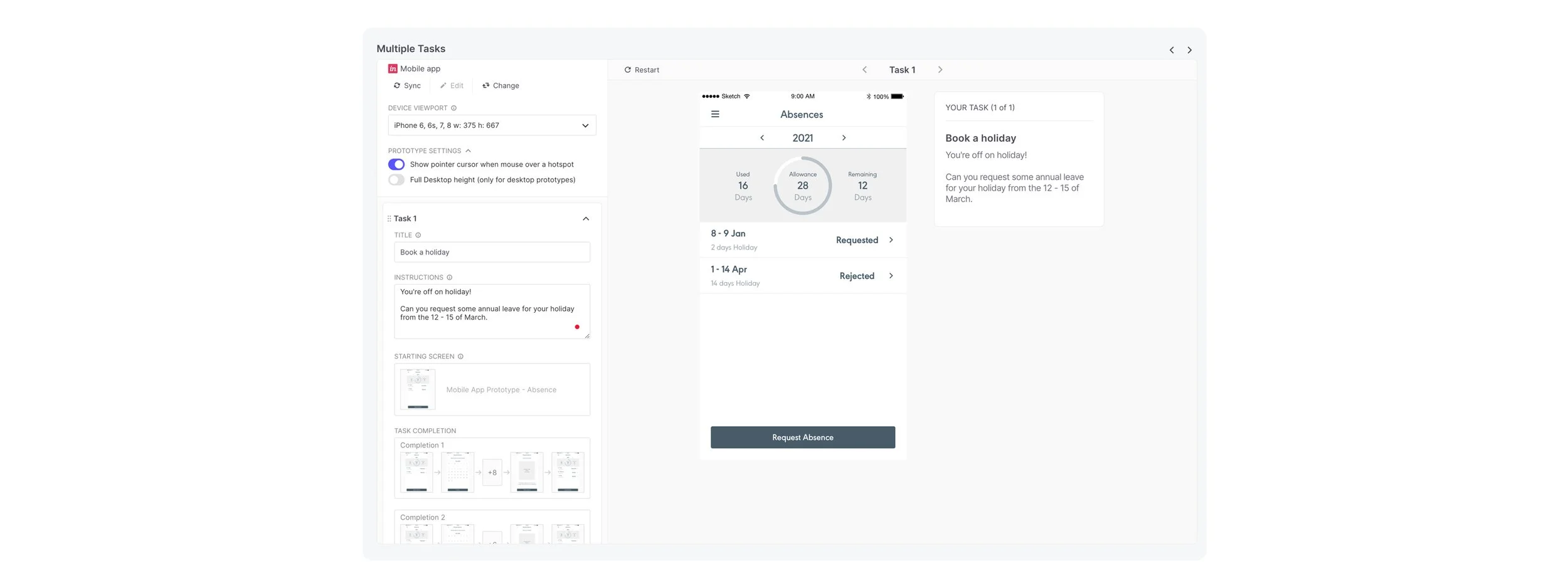
Requesting annual leave holiday
Combining all the knowledge gained from the above exercises, we started sketching on printed mockups, considering page architecture, component positioning right through to what the copy said. These sketches naturally involved into working on low fi wireframes, transferring from paper to screen.
The wireframes started to take shape, using the Rotaready’s component library, we started to put together full pages. There were also bespoke components to the project. Things that weren’t going to be used across the wider product. These were purpose built for the mobile app. This was an iterative stage, constantly showing and reevaluating with the stakeholders.
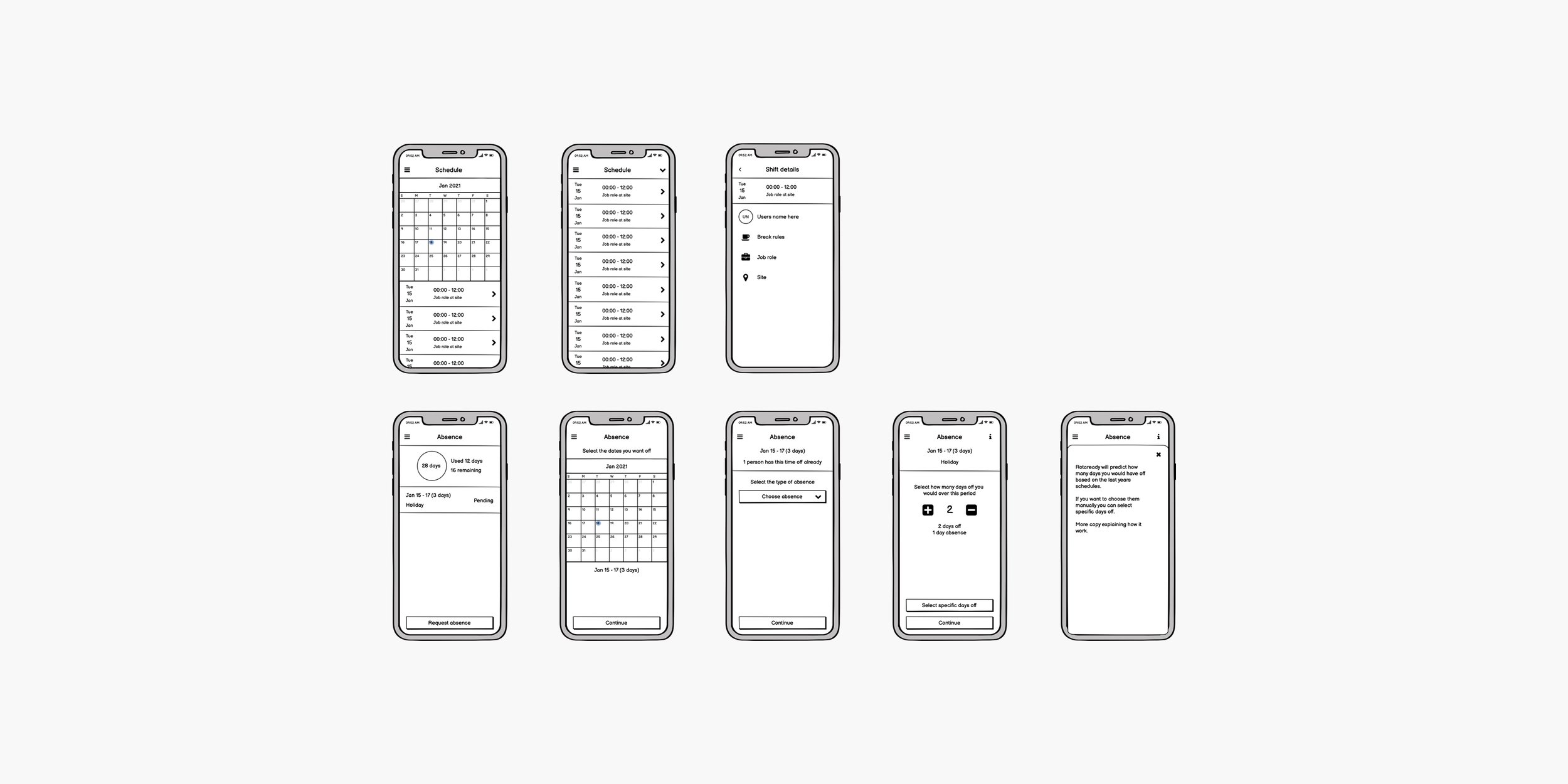
Balsamiq wireframes
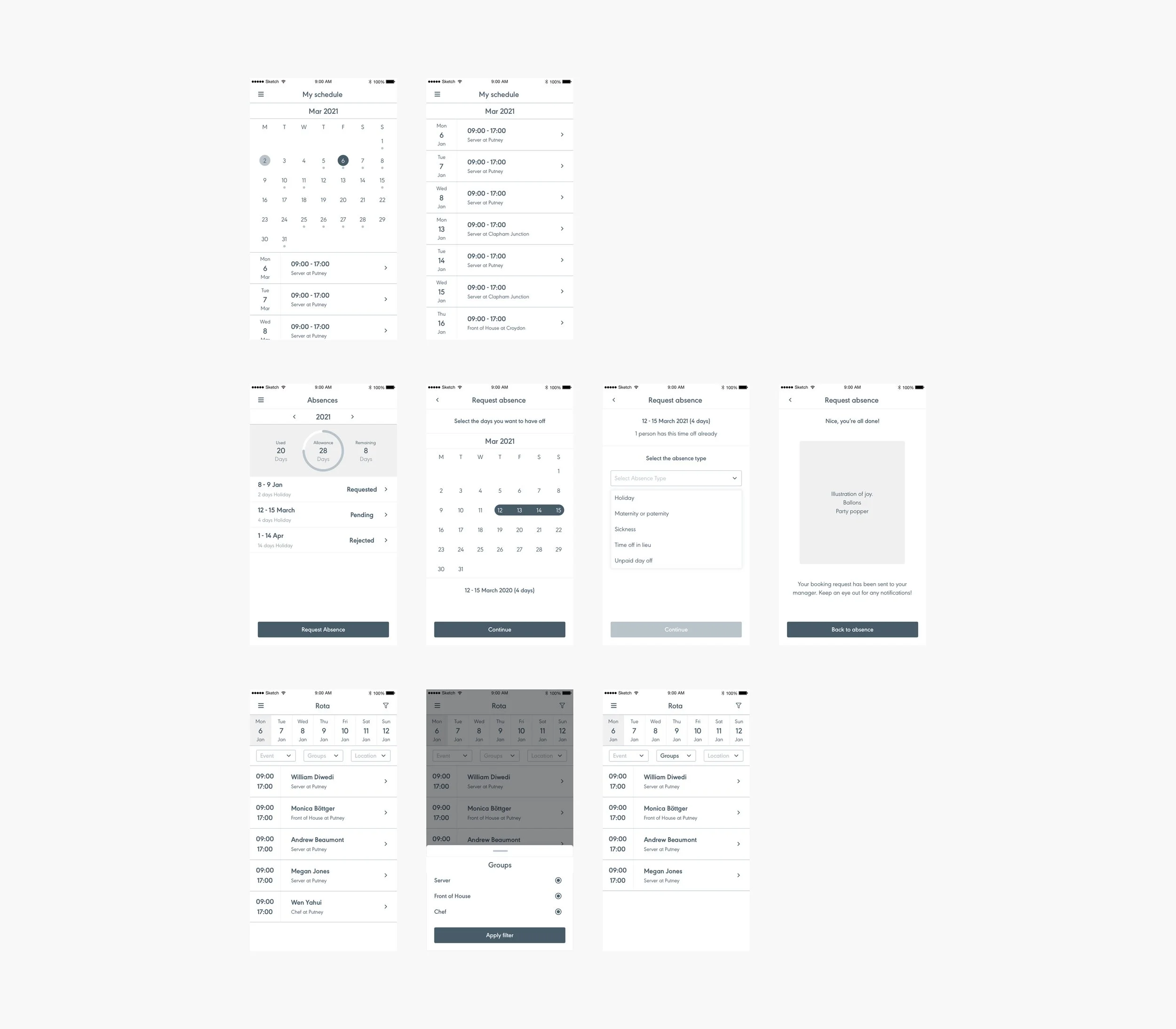
Sketch wireframes
Prototype testing
Once we felt comfortable with the wireframes, we decided to test. Luckily, because the target audience was the end-user, we could test out an early prototype on pretty much anyone. Our user base ranges from 16-year-olds to 70-year-olds from all types of demographics. With this in mind, we reached out to friends and family linking them to the prototype. We gave them a script and character to get into and set a range of tasks for them to complete. We observed how they got on. One particular benefit of this exercise was it meant different areas of the company got involved in user testing.
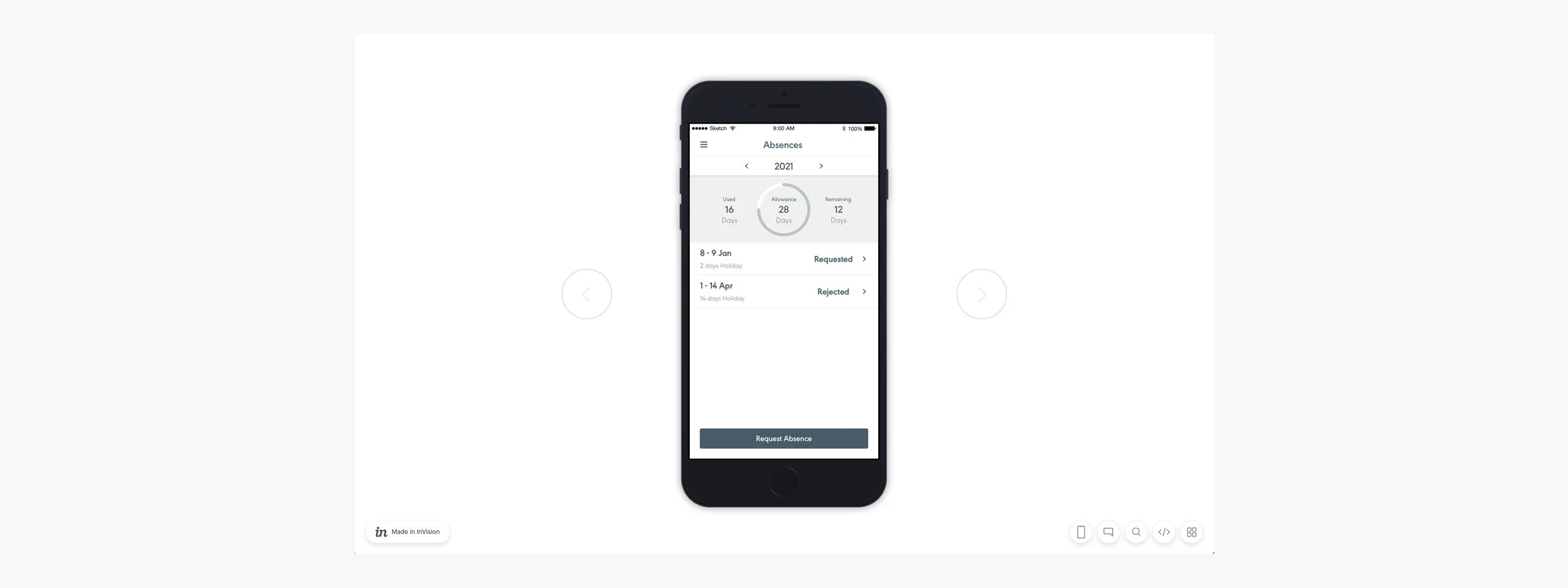
User testing with Invision
User testing with Useberry
Additionally, we set up the same tests using Useberry. This meant we could reach the same audience, but remotely giving us greater reach. Useberry records screens which meant we could revisit the test and eventuate any pain points.
We noted down the results from both sets of tests, filtered through them and implemented ones we felt were needed.

Quotes from user testing
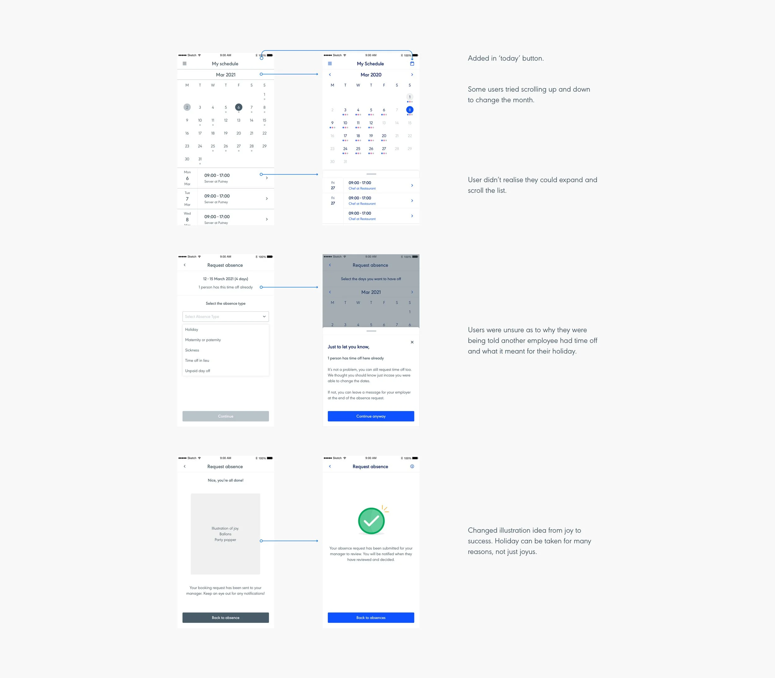
User testing iterations
User interface
Naturally, once we felt the wireframes were in a good spot, we began to move on to the UI. We use our own component library for Rotaready which has been developed and implemented into everything we do, the UI began to fall into place. Switching out wireframes for UI components, ensuring we were using the correct colour, meant the UI screens came together nice and quick. A handful of pieces needed to be finished off as they didn’t exist in the Styleguide and had to be bespoke built. These were then retrospectively added to the guide for future projects.
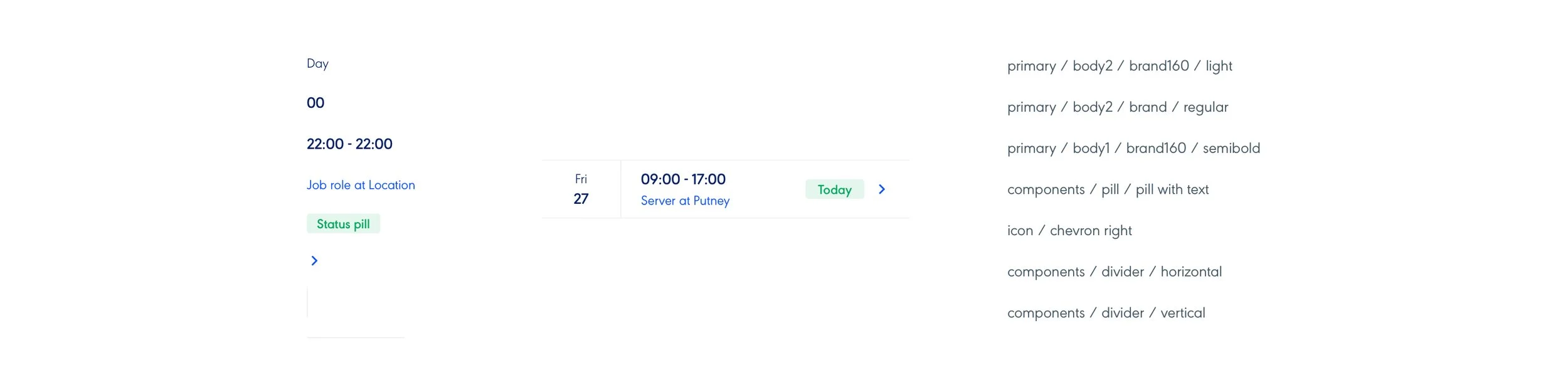
UI components atoms
UI components organisms
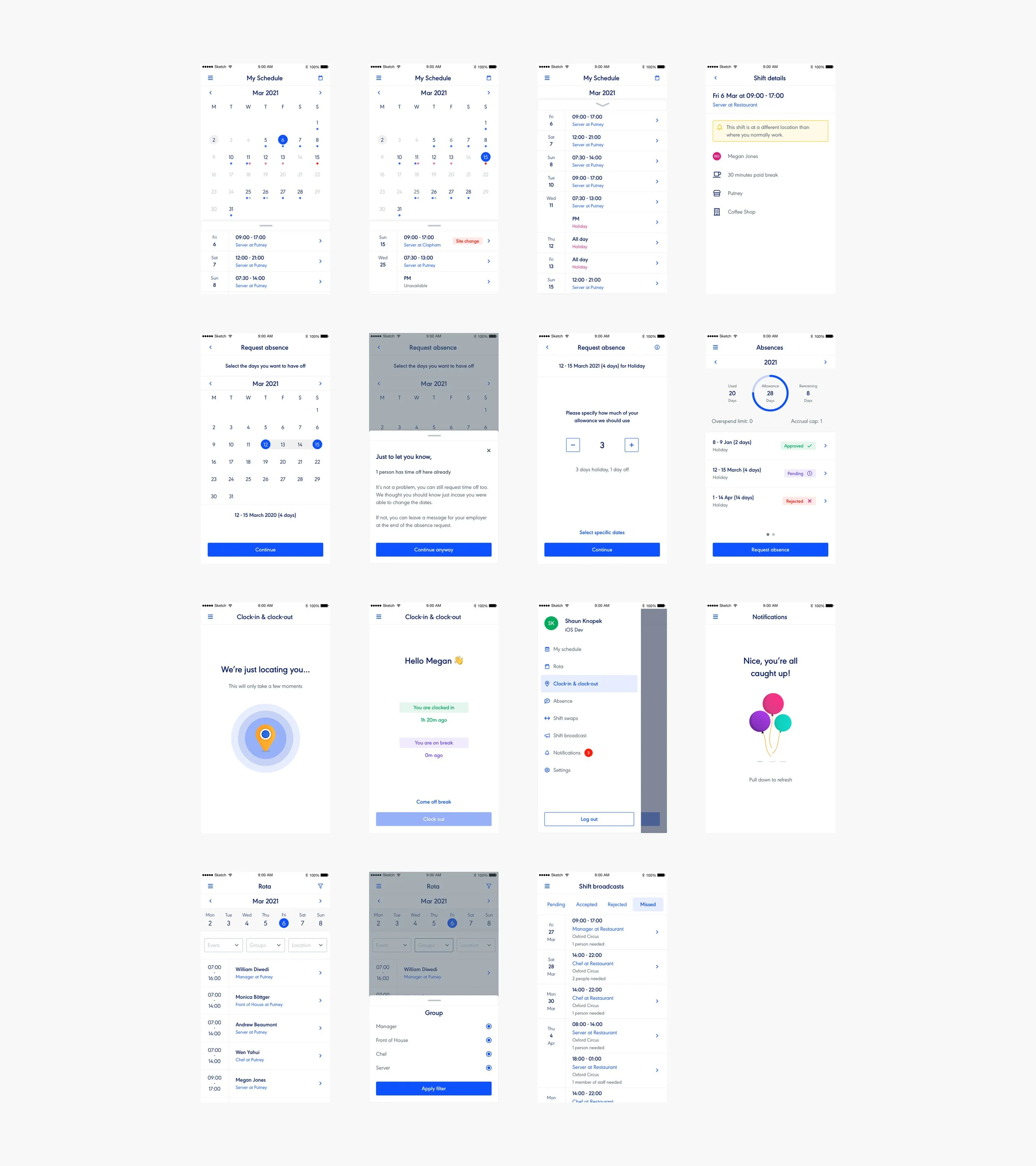
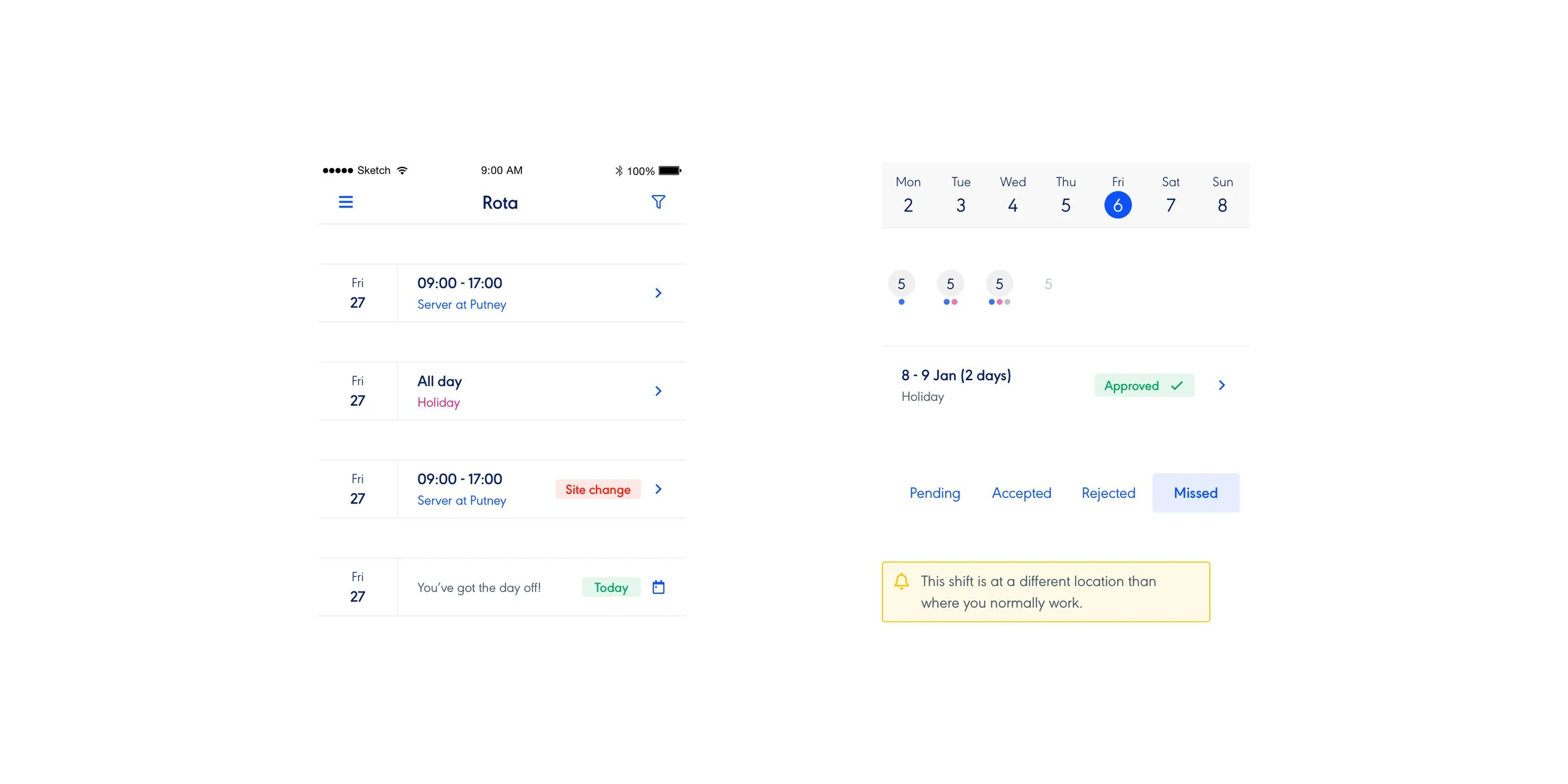
UI pages

Light and dark mode
Implement
Our chosen tool for design to dev handover is Zeplin. We have our components, colours and text styles all linked together with the mobile app project so Dev could see what was being used. This is key to creating consistency across all our products. At this point in the project, a handful of devs had been involved and had helped iterate throughout the whole process.
We have a weekly meeting called ‘Show and tell’ so we utilised this to share the project with the wider team and get feedback. It was beneficial getting fresh eyes on the project. People spot things and ask questions, ironing out any potential issues early.
This stage is a continued iterative stage where I would be pairing with the devs. We would have huddles to discuss anything that was blocked to come to decisions and move on efficiently.

Zeplin handover
Evaluate
Before we push anything out, and to help limit changes and pain points for users, we review an alpha build internally. The natural progression for reviewing is first design followed by dev and finally the wider company. This allows for a holistic review process. By staggering the review order, design and dev can work through any issues raised without being overwhelmed. Plus this helps avoid overlapping issues.
A google sheet was put together to collect the feedback. The piece was stress-tested, with everyone using the product, raising bugs across a range of devices. These bugs were squashed and we cleared through a bunch of build issues as well as confirmed usability and design.

Alpha build review
Release
The next step was to release the mobile app. We created the App Store and Google Play store screens across both mobile and iPad and waited for them both to be approved by Apple and Google. We pushed out communication through our blog, email, social channels and intercom via our app giving people notice of the update.
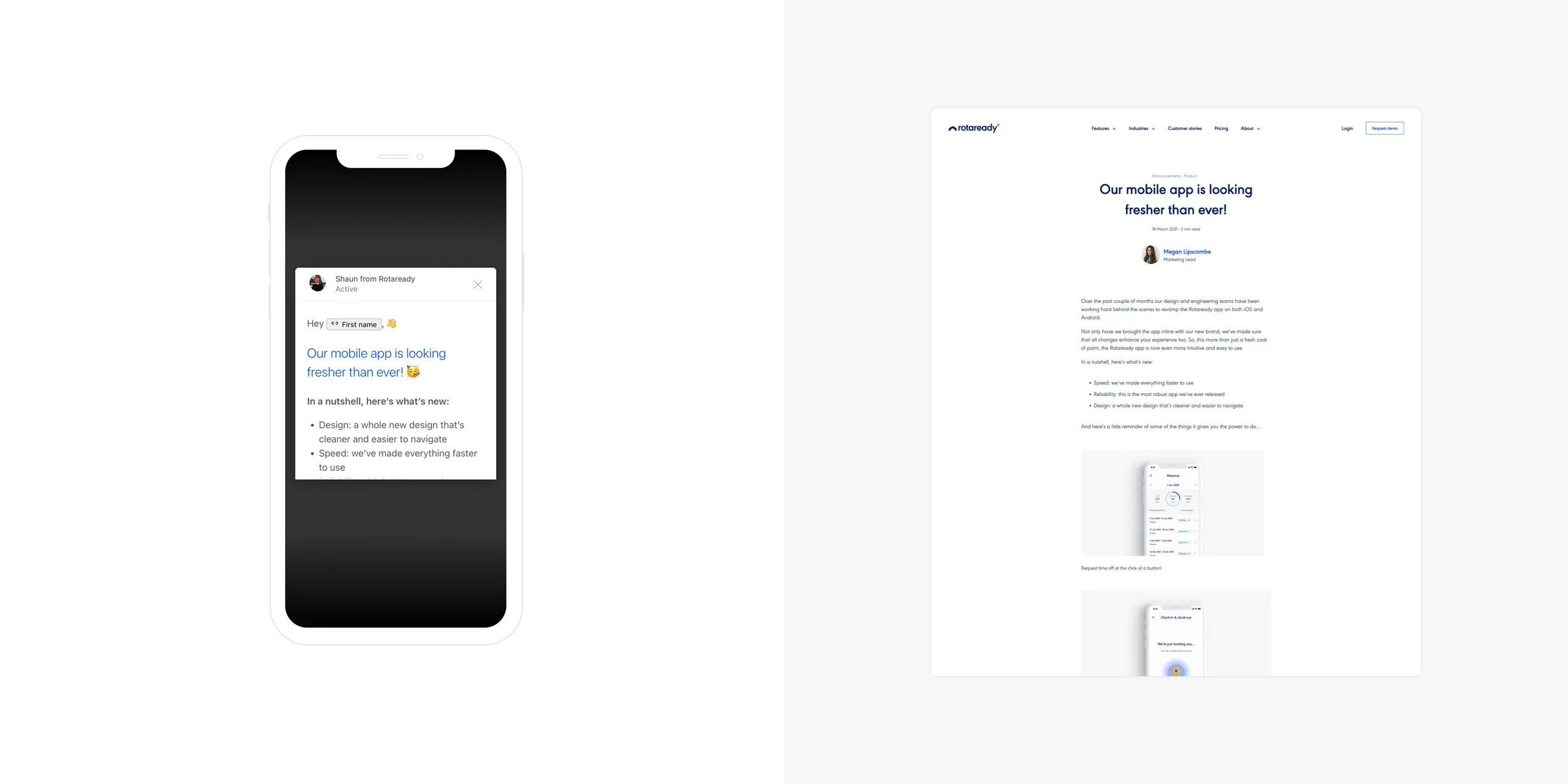
Examples of release material
We monitored both App Store reviews, receiving both positive and negative. We recorded the negative feedback and filtered through anything that needed immediate attention. Naturally, bugs started to appear that we hadn’t come across which were addressed. Some feedback was useful and constructive, some were not! A large number of negative reviews came from forcing users to have to re-login into the app. This was unavoidable since we totally overhauled the codebase. Users forgot their login credentials and went and reviewed the app. We didn’t appreciate the frustration this would cause. We helped ease this by linking to articles on our help desk on how to reset passwords, along with making the reset password button more apparent when logging in.

Reviews from app store
Sign off
This project has been ongoing. We have introduced some new features since the release and continually resolved bugs that appear after updates. Looking back on our anchor points for the project, introducing new features, using a new code base and a design refresh, we completed all three of these, with the addition of creating a better experience for users with reworks to pages that needed them. These points also have helped future proof and build foundations for the app, meaning new changes and updates are no longer bottlenecking.
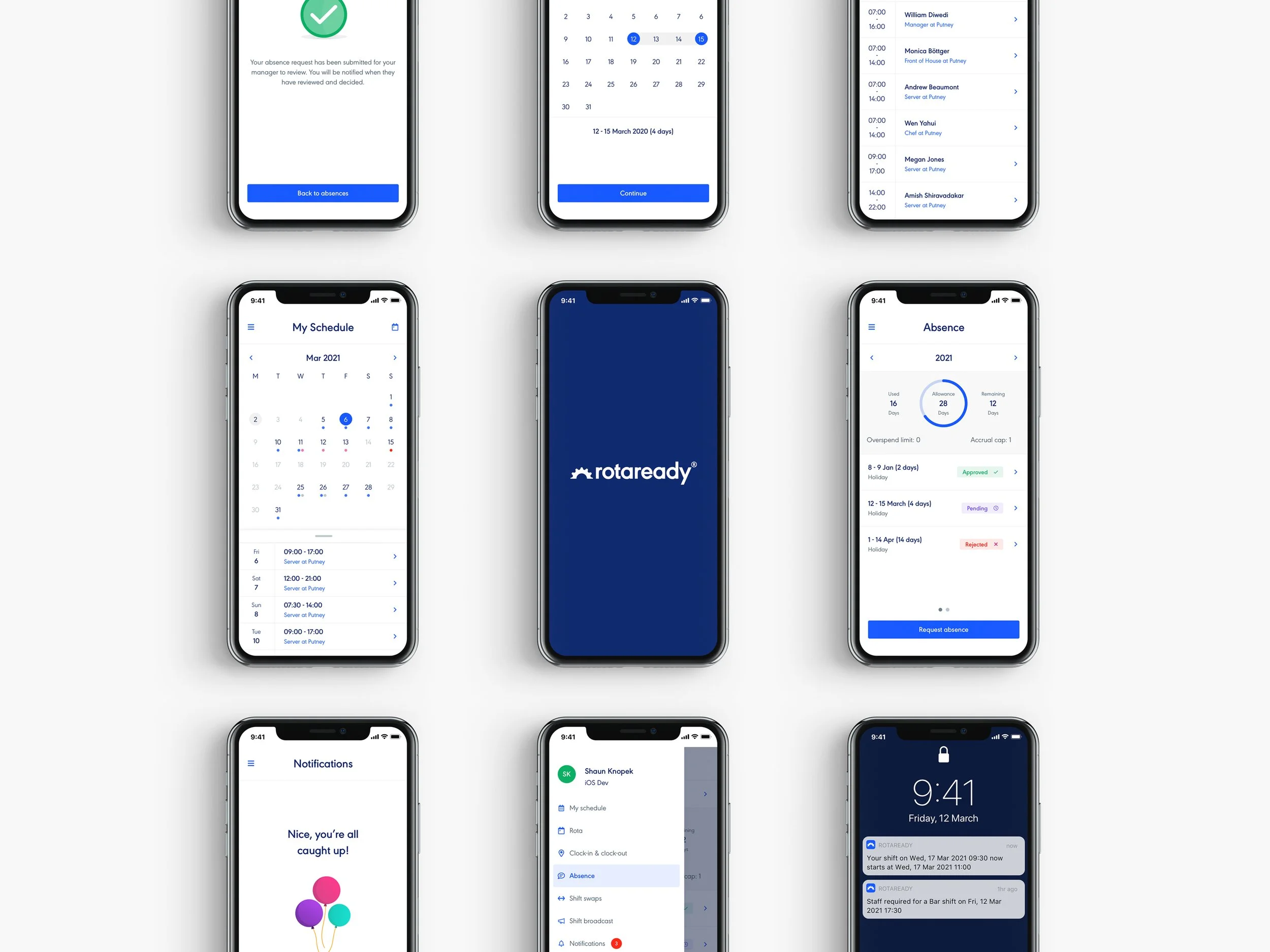
Hi fi pages