Rota Editor
This project covers the start to finish of the design process for a product release and showcases the stages involved. The first release ran for around 8 months, from start to finish.
📕 Read time - About 10 minutes
🔎 Project includes - User research, wireframing, prototyping, UI design, user testing, continued documentation, handover with dev, branding (separate project), feedback, and releasing.

Marketing feature image
My role and the team
💻 The core team consisted of - 1 Product designer (myself), 1 Head of engineering, 1 Lead engineer, 3 Engineers, and 1 ML engineer (working on our Sale Forecast tool which plugged into the Rota Editor project).
Project background
The rota editor is referred to as the ‘jewel in the crown’ within Rotaready. It has become an integral part of our customer’s roles and is used on a daily basis. The editor is relied upon to help create rotas in a fast and efficient way. The importance of this tool was paramount. The clue is on the name!
The original editor was built early on and had been continually iterated on. Under the hood it worked great, however, it had never had any user or design insight applied.
Since its initial build, the product team had grown. Rotaready had also become more driven by UX, along with the addition of Rotaready’s new brand, it became apparent that the tool needed a complete refresh rather than another round of iterations.
Rotaready strives to be a product that focuses on its users so naturally, our journey started with them.

Hi-fidelity screen
Research
By conducting user research we are able to understand how our product is being used in a real environment which subsequently gave us insight into how to improve and better it for the user.
We spoke to 12 different customers, ranging in size and traditional use of the product. Customers down in Portsmouth, to central London, and all the way up in Aberdeen. We found a wide cross-section of users for the product, ensuring the research was as diverse and fair as possible.
Each session lasted around an hour and included a series of tasks set about to explore the user’s knowledge of the rota editor. The sessions were very informal but were recorded.
Once completed, I reviewed and transcribed the footage, grouped the areas we explored, and started to find trends in the information. The documents were shared internally with stakeholders.
These interviews showcased some interesting and wonderful ways our users used the editor, as well as gave us clear areas where we could improve the product.
“I don’t know what it is, I don’t know what it does,
I’ve never pressed it.”
Quote from user research

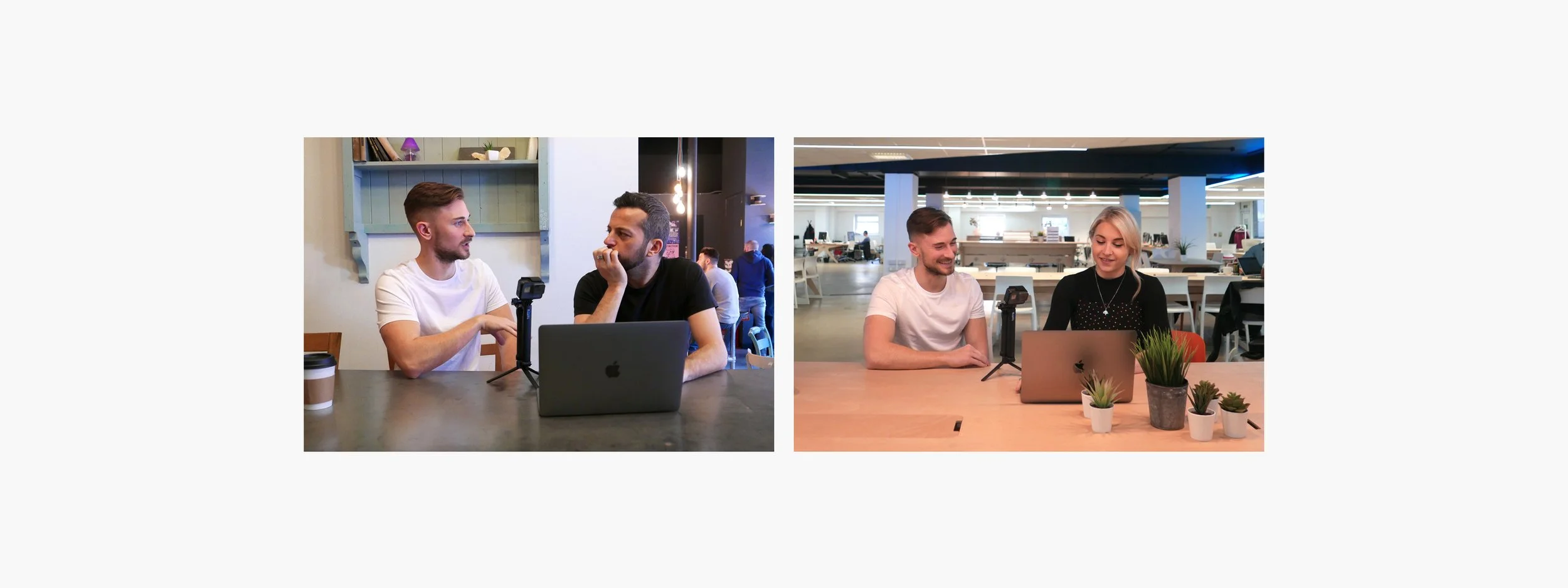
Screenshots from user research recordings

Conversations from user research recordings
Company personas and comp analysis
One outcome of the user research was to produce personas. From the transcribed documents, I tracked trends, themes, and threads throughout the 5 key areas covered in the interviews.
Naturally, 3 groups started to form, giving me my personas. I combined the individual people together to make the personas, each being an amalgamation of different characteristics and allowing us to refer back to them throughout the project.
Finally, alongside user research, I also conducted direct and indirect competitor analysis. The objective was to explore products that already existed and that users would be familiar with, documenting how they worked. This ultimately helped fuel intuitive design.

Example of personas
Workshops
The research had been shared and digested, I’d created and shared personas and comp analysis. The next step was to run alignment workshops with the stakeholders.
Included within these workshops were initial company stakeholders, as well as members from each team of Rotaready, from design and dev, through to customer support and sales and of course, snacks! This pool of people aimed to give a holistic approach to our analysis and initial ideation. By running several workshops with different people from their respective teams, we were as diverse as possible in our outcomes.
The purpose of the workshops was to agree upon a direction for how we wanted to take the project, a rough information architecture to gain like-for-like parity, and clear anchor points, all based on the previously shared research.
We came about these points by discussing what we found from the user research, personas, and analysis, combined with our knowledge of the current app and sketching out any ideas we had. Our success team was able to offer their insights into the daily struggles users had, many of which aligned with the research.

Workshop photos
Agreed upon objectives
We established 4 areas we wanted to aim for when rebuilding the rota editor
Intuitive and familiar, a combination of excel and a calendar.
Least number of user interactions, reducing the time it takes to publish a rotas.
Overview and scope of control, giving users a central hub for their rota needs.
Pleasurable experience, combining good UX and fresh UI.
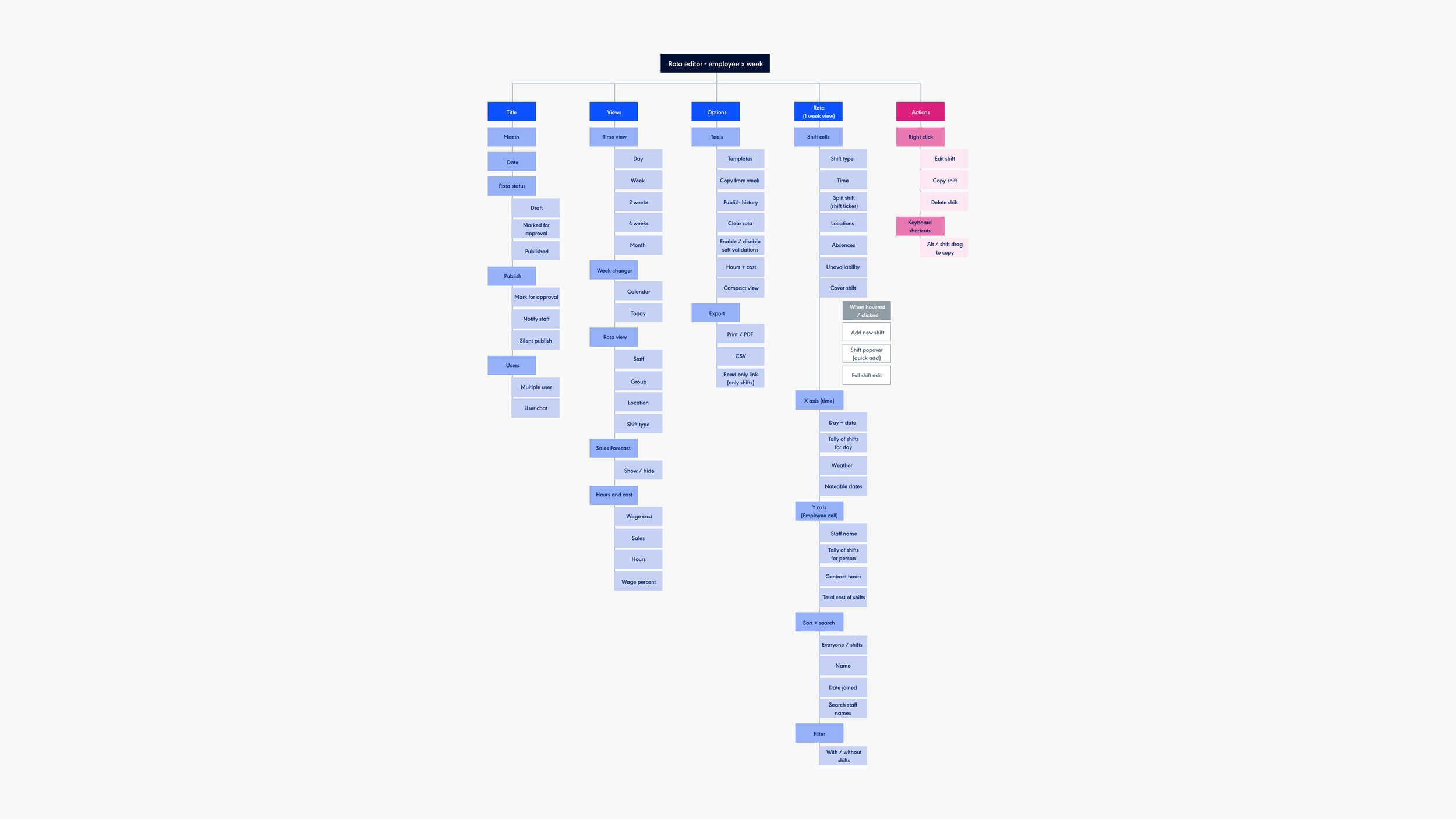
Section of IA
Flows, IA and wireframes
Taking the outcomes of the workshops I then set about cementing the information architecture and working up refined user flows and user journeys. I kept showing stakeholders to gain feedback and iterate. When we were happy I began working on low-fidelity wireframes.
Throughout our research and workshops, the most intuitive design seemed to use an axis, one side having staff and the other having time. Using this as a starting point, I began to lay the pieces out from the architecture, forming a rough structure for the page. We worked atomically allowing me to focus on specific components and their function, bit by bit, building up to whole pages.
Similar to the architecture and flows, I was getting continuous feedback on the wireframes, iterating components, and re-ordering structure based on feedback and discussions. The development team also helped stress-test the designs. They asked questions and found edge cases to ensure correct functionality as well as finding potential issues that needed addressing.
To get assets over to the development team I used Zeplin. Even though the designs were wireframes, getting them over to development early allowed dev to start exploring how they could build it.

Example of user flow
Example of user flow
User interface
When we had the wireframes in a healthy stage, we began putting flesh on the bones. Separately, we had been building our component library in Sketch and Storybook, which included the new brand, allowing easier consistency and continuing to practice atomic design principles. However, not all components were pre-existing. A large amount was bespoke to this project so the time had to be set aside to finesse certain areas to align with the styleguide.
The objective at this point was to get the designs good enough to conduct user testing and prove proof of concept across the main flows.

UI components
Evaluate
We had main objectives we wanted to test, things we felt needed validating before continuing so we conducted some usability tests. I formulated a script, which included a quick icebreaker, setting tasks, observing and recording tasks and finally feedback. The whole thing took around 30 minutes. The tasks were written as scenarios and flows for the user to perform. These tasks were conducted in person. We invited varying candidates all with nods to our persons.
Pictures from user testing
Here are some of the examples of things we discovered during the sit-downs.
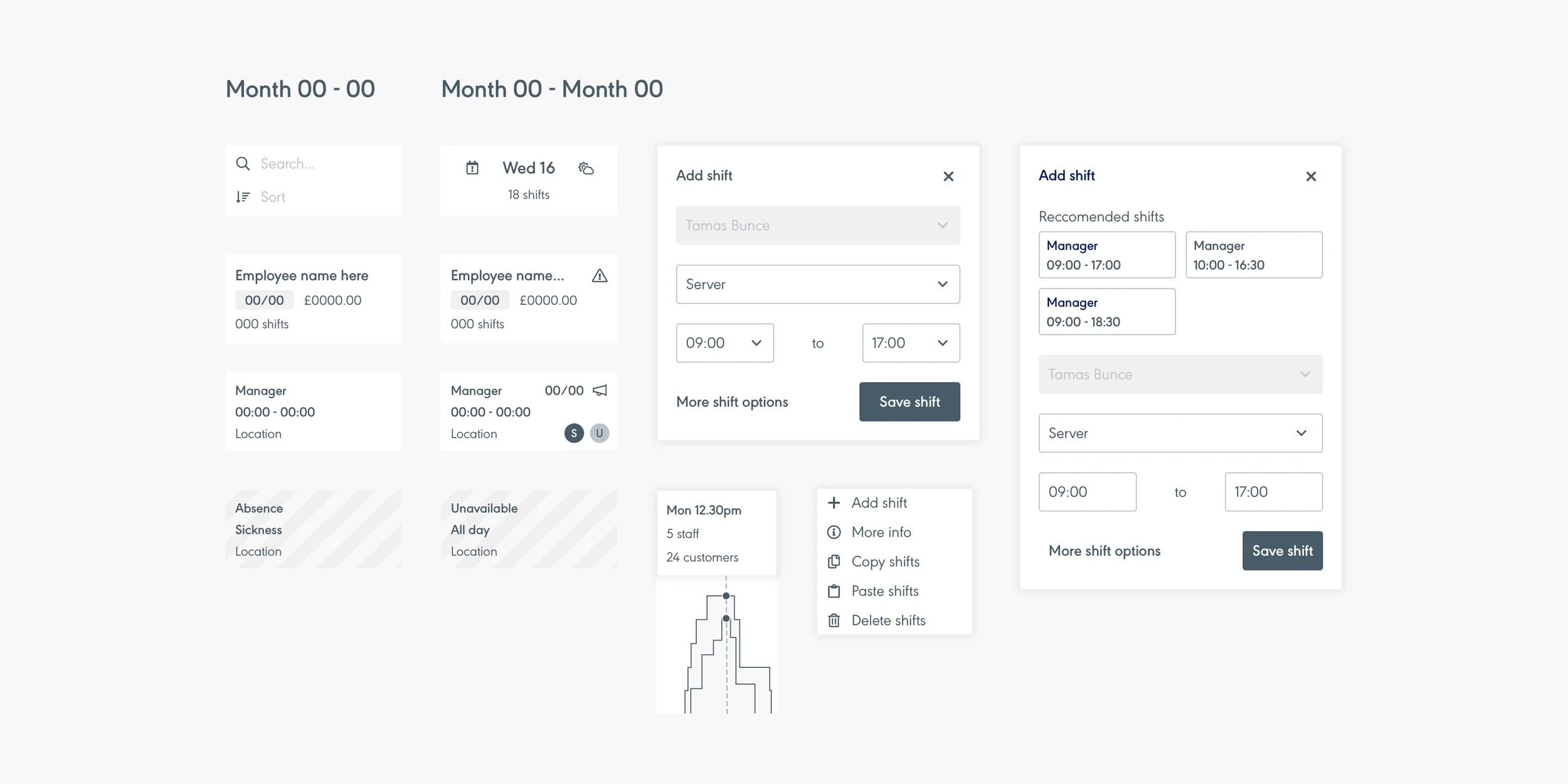
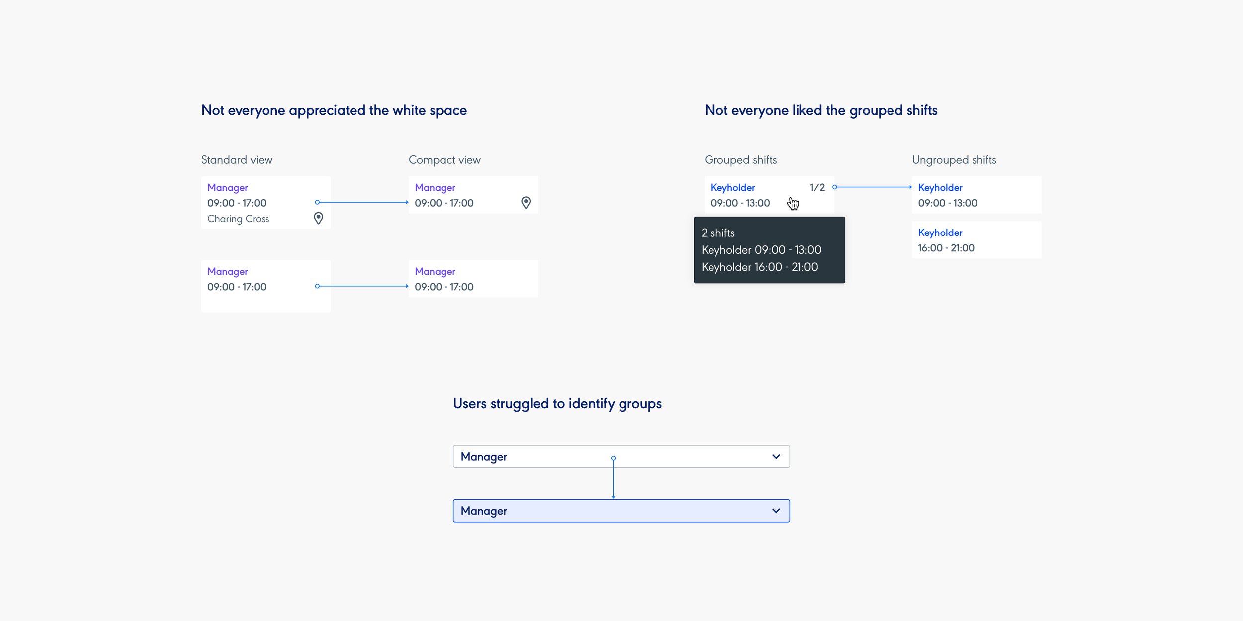
Some users either didn’t use the third line of the shift cell, or were fine with the info being displayed on hover. This meant there was a lot of white space on the standard shift cell. We introduced ‘compact’ view to reduce the white space and tighten the whole rota up getting more rows of staff.
We also found that the accordion being used to group the shifts blended in too much with the rest of the page and needed a way to stand out to help with the visual hierarchy of the rota.
Additionally, some of the fall out of testing aligned with our project anchor points. For example ‘overview and scope of control’ could be aided by giving users the option to group and ungroup their shifts.
Once we had implemented the results of testing into the designs, I refined the UI and shared the work with dev.
Iterations from user testing feedback
Handover and dev
At this stage I’d ensured the handover was as fluid as possible using Zeplin and by offering any assistance to the development team when needed. Despite all the research and foundations we lay, sometimes things slip through the gaps and we had to address them. Sometimes it was just a quick yes or no answer that the dev team was looking for, but it was important to keep involved, and with the user as my main focus, when changes were being suggested and iterated.
We practice agile so constant communication was happening, along with 2-week sprints, giving me visibility of the work and progress. Additionally, if needed, huddles were called to come to quick solutions and allow us to move forward efficiently.
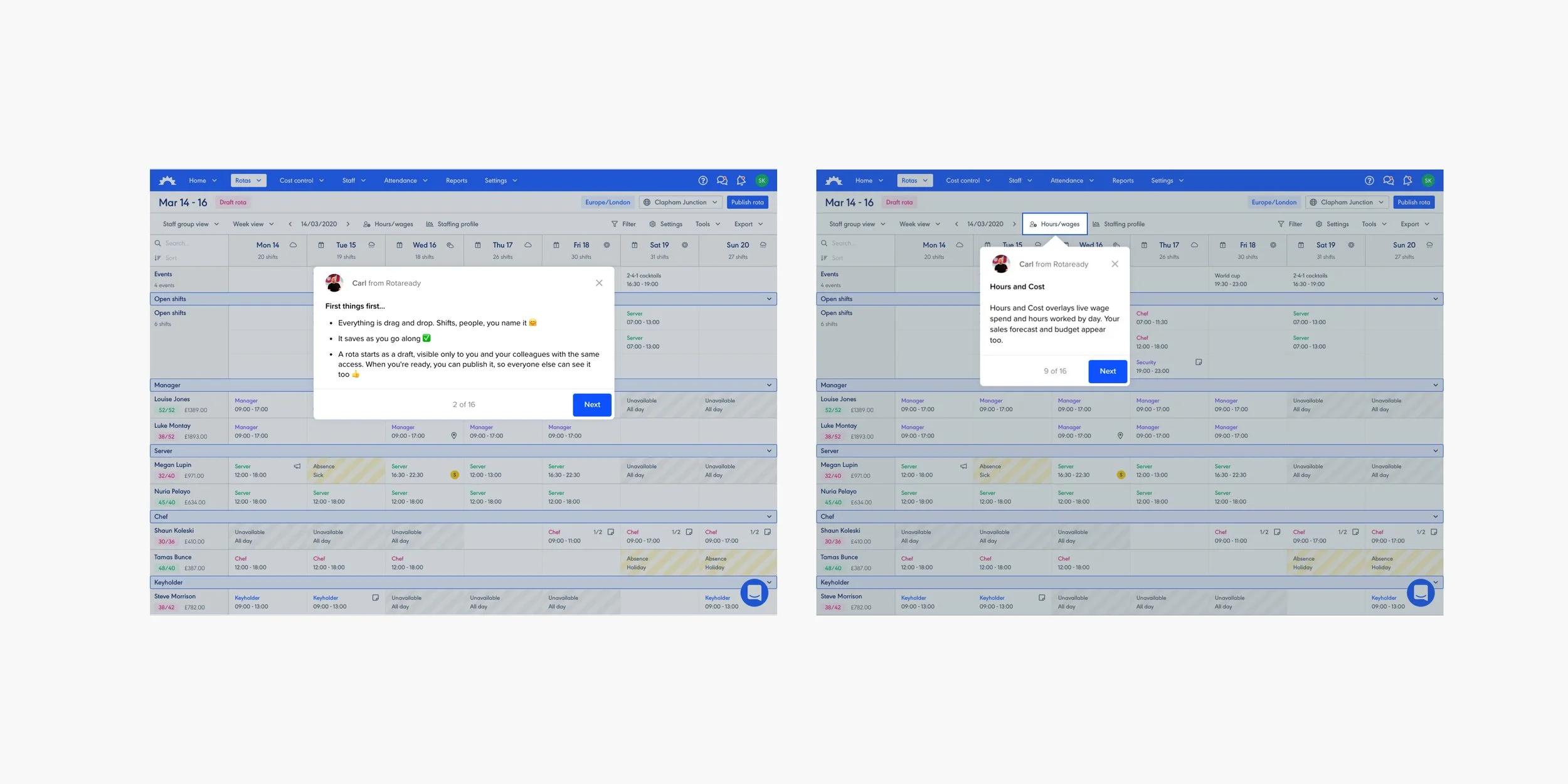
Reviewing internally
We now had an alpha version of the product. Before releasing it to our customers, we first had to review it internally. The natural progression is UX review, followed by Dev review, and finally Success and Support review. This allows a holistic review process. By staggering the review order Design and Dev can deal with requests iteratively instead of being overwhelmed. Plus this should avoid overlapping issues. Marketing was also looped in to familiarise themselves with the release and prepare client comms.
The internal feedback was collected and ordered in priority. We agreed on what was needed to progress to beta and made tweaks and amends to get there.

Intercom banner and message
Releasing
In the build-up to releasing the Rota editor, we had been using Intercom to inform users of the upcoming changes. We ran banners encouraging users to opt in to the beta to try it out, as well as giving them a cut-off point for when the old editor would be deprecated. We also allowed users to opt-out if they wanted to use the old product for a bit longer before being deprecated.
Attached to the beta was an Intercom product tour which allowed us to create an onboarding walkthrough. Despite creating the designs to be as intuitive as possible, we felt because of the scale of the work, an onboarding piece would help. Plus, users could always ignore it if they ere in a rush, or come back to it at a later date via Intercom.
Finally, we released communication pieces to give as much warning changes were coming via email and social. Our support team was briefed and familiar with the new changes.
Intercom product tour
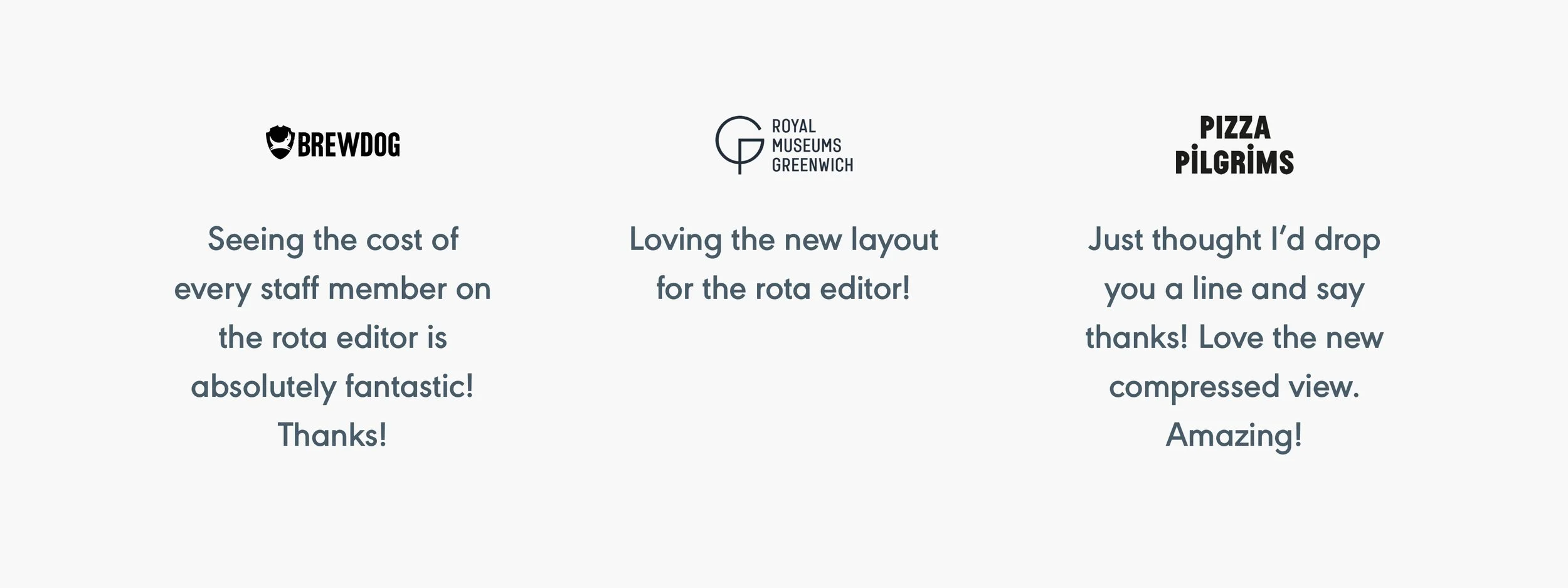
User feedback
Once the beta had been released and users had been given time to settle into the new update, we encouraged feedback via Intercom chat. This feedback was both quantitive and qualitative as it collected a simple vote for like or dislike, as well as encouraging feedback via the chat.
Notably, we did struggle with engagement for feedback at the start. However. Users didn’t seem to be giving us much negative feedback either though. Eventually, feedback started to come through more organically, over the phone or while support helped customers via Intercom.
Areas we have had the most feedback were
Around the rota behaving like a calendar (week changer)
Seeing the charts on the rota (staffing profile)
Seeing the cost of the rota (hours/wages)
The size, layout and new design.
The flexibility of the rota and always persisting.

Intercom feedback
The majority of negative feedback was around the change. Despite the reminders of the upcoming change, users still found having such an integral tool to their working lives switched on them frustrating. There were no specific reasons for the negative feedback, despite offering more products and what we felt was a better experience.
Feedback ranged from “I preferred the old style” and some valid points about seeing fewer rows of the rota than before, but this was resolved when they were shown compact mode. Interestingly, we found legacy users were the most frustrated by the change, recent customers welcomed the new rota.
The negative feedbackers were reached out to and encouraged to elaborate if we didn’t have much to go on. One user even said they now liked the new version and when they reviewed they were having a bad day!
User quotes via Intercom and email
Some numbers
The below data is taken from QuickSight, around 3 years after the first launch of the project. The project has been implemented into the day-to-day working lives of our customers and is evidenced by the numbers here. This data doesn’t take into account blackout periods due to COVID-19.

Results taken from QuickSight
Sign-off
Releasing such a huge, integral part of Rotaready was a challenge. There was a clear need for it, both from a user and business view, but managing the project and replacing it with at least like-for-like parity meant a lot of change in a short period of time.
We also have plans for features and iterations we know are wanted and needed, things we purposely left out but were included in the 100% information architecture.
We now have a better foundation to build on in the future.

Hi-fidelity screens